Matplotlib with Python: E-commerce Data Visualization
Enroll now →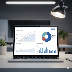
About this course
Matplotlib E-commerce Data Visualization with Python is an intermediate-level course that teaches you how to analyze e-commerce datasets and create meaningful visualizations using Python and Matplotlib. Through a practical case study, you will build the skills to set up your analysis environment, prepare data, and transform raw business data into clear visual insights. You will begin by installing and configuring Anaconda and Matplotlib, exploring dataset characteristics, identifying unique values, and preparing data for analysis. Next, you will learn the fundamentals of Matplotlib, including figures, axes, and state-based versus object-oriented plotting approaches. Building on this foundation, you will construct line graphs, histograms, bar graphs, scatter plots, pie charts, and boxplots to interpret trends, compare categories, evaluate relationships, and analyze statistical summaries such as quartiles and outliers. Designed for learners interested in data science, business analytics, or Python-based data visualization, this course emphasizes hands-on application using real e-commerce datasets. By the end of the course, you will be able to analyze e-commerce data, apply Matplotlib visualization techniques, and interpret patterns that support informed business insights and data-driven decision-making.
What you'll learn
- set up Anaconda and Matplotlib
- analyze e-commerce datasets
- create line graphs, histograms, bar graphs, scatter plots, pie charts, and boxplots
- interpret trends and statistical summaries
Skills you'll gain
Related courses
Data Science Foundations
USD 49

Data Analytics in the Public Sector with R
USD 49

Data Science as a Field
USD 99

Geographic Information Systems (GIS)
USD 49

Statistical Methods and Data Analysis
USD 49
Data Visualization & Analytics in Tableau
USD 49

Enhancing Reproducible Science with GitHub and Docker
USD 49

Programming for Python Data Science: Principles to Practice
USD 49
Course details are provided by the platform and may change — always confirm on the provider's site. Links may be affiliate links.