Excel: Creating a graphical business dashboard
Enroll now →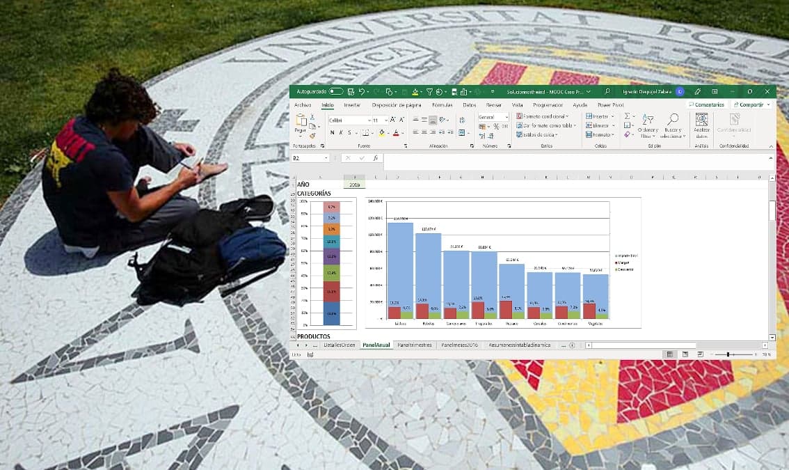
About this course
Consolidate and expand your Excel knowledge with a case study
What you'll learn
- create graphical dashboards in Excel
- apply data visualization techniques
- analyze business data effectively
Skills you'll gain
Related courses

Data Science Foundations
USD 49

Data Science as a Field
USD 99

Geographic Information Systems (GIS)
USD 49

Social Media Analytics
USD 49

Introduction to Business Analytics: Communicating with Data
USD 79

Data Analytics in the Public Sector with R
USD 49
Data Visualization & Analytics in Tableau
USD 49

Statistical Methods and Data Analysis
USD 49
Course details are provided by the platform and may change — always confirm on the provider's site. Links may be affiliate links.